GEOGRAPHIC ALGORITHMIC BUSINESS ANALYSIS

GABA
A telecommunications company approached me with the challenge of creating both a name and a visual identity for one of their new products. The product itself, later named GABA, is a powerful tool that acts as a filter for telecommunications providers, enabling them to analise a specific geographic area and identify where internet connections are weak. With this insight, companies can directly target potential customers who are in genuine need of better connectivity. This turns a traditionally broad and expensive marketing effort into a streamlined and highly efficient strategy, solving the company’s need to communicate both the function and value of the product in a way that feels technical yet approachable.


Using data from a different perspective.
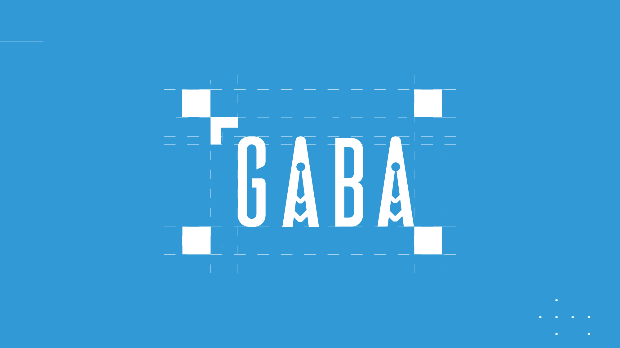
The final logo incorporates subtle but deliberate design elements where both “A”s in GABA feature the form of telecommunications towers, symbolising coverage, signal, and connection. This not only reinforced the product’s purpose but also gave the identity a distinctive visual anchor that makes it immediately recognisable in their industry. Through this collaboration, the company gained more than just a logo, they gained a brand system that supports the story of their product and helps position GABA as a smart solution that allows telecom companies to save money, increase efficiency, and connect more people to better internet service.

